 |
 |
 |
 |
 |
The Data Editor
|
|
|
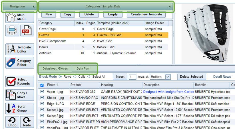
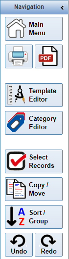
The Navigation Bar
|
|
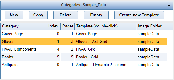
The Category Window
|
|
There are five buttons in the Header of the Category Window.
|
|
Within the Category Window, there are several more functions that can be performed by Clicking or Double-clicking a Row or Header.
|
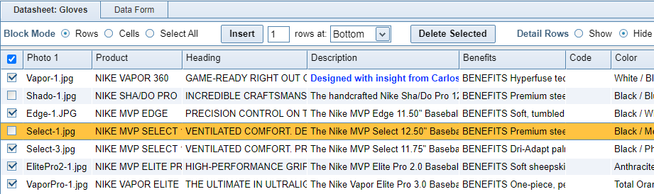
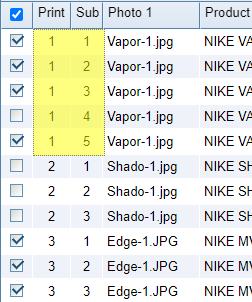
The Datasheet
|
The Datasheet is the online equivalent of a Spreadsheet. It contains a grid of cells which may store a variety of information: Text, Dates, Numbers, HTML Text, or Photos. |
|
|
There are several functions in the Datasheet Header.
|
|
The Datasheet is highly customizable. Using the Category Editor form, you can select which columns to display and also configure the column type. In addtion to a standard Text field, you can set a column to contain HTML or Photos. You can change the width of the columns by placing your mouse at the line between column headers (it will change into a double-sided arrow) and dragging the column to a new width. You can change the position of a column by clicking and holding down your mouse in the column header, and then dragging the column. |
|
|
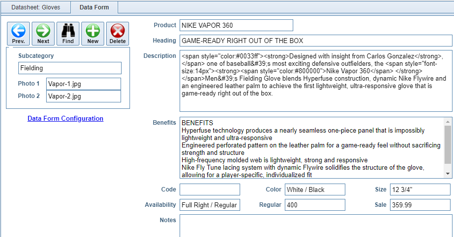
The Data Form
|
The Data Form is a customizable, single-product editor. Double-click any cell to open the appropriate text editor or photo selector, depennding on the field type. |
|
|
View the Data Form Configuration Tutorial for instructions on customizing the Data Form. |