Samples Product Information Home Page Pricing Pricing

Page Layout

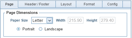
This tutorial covers the Page Layout options of template creation. To edit these, first select Template Editor from the sidebar. Then choose the template you wish to edit, and click Page Setup.

The Page Editor is divided into two sections: the left side, which contains all of the page layout options, and the right side, which shows a preview of your page layout.

All measurements in this tutorial are in millimetres. You can change your Order of Measure between millimetres and inches on the Configuration page.

Page Tab

The first options under the page tab allow you to choose your page dimensions. The default options are A4 and Letter, but you can also choose your own custom page size.

You are also given the options of Portrait or Landscape orientation.

The Margins options allow you to adjust the Top and Bottom margins. The Outside option will adjust both the Left and Right margins equally. If you require a greater margin on the inside edge of the catalog, a Binding Offset can be set on the Printing Menu.

You can also select whether your Header and Footer extend to the sides of the page, or are limited by the width of the page’s content.

Enabling Category Tabs causes labels to be printed on the outside edge of each page. The Tab Source defines what text will be on the tab. Sources ending with “Text” will display the full name, while sources ending with “Initial” will display an abbreviated version.

The Top option defines the distance from the top of the page to the top of the Label. Height sets the vertical height of the Tab, while Width sets the horizontal width of the Tab. Width will not affect the size of the Tab’s text.

Header/Footer Tab

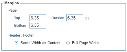
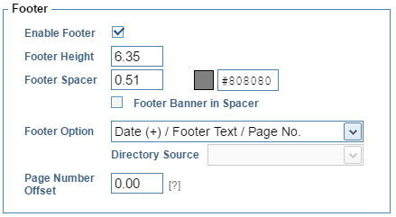
There are separate options for both Headers and Footers. You may also disable your Header or Footer if you so choose.

The majority of Footer options are the same as the Header options.

Header Height will increase the vertical size of the header, while Header Spacer will increase the size of the bar separating the header from the product display units.

To change the colour of the separating bar, click the hex code next to the coloured box to open the Colour Selection window. To save a custom colour, select one of the presets at the bottom of the window, then choose your colour, and finally click the Save button to overwrite the selected preset.

To change the colour of the separating bar, click the hex code next to the coloured box to open the Colour Selection window. To save a custom colour, select one of the presets at the bottom of the window, then choose your colour, and finally click the Save button to overwrite the selected preset.

You can cause your Category Banner to appear in the coloured bar by checking its box. Set your category banner on the Category Editor page.

Finally, there is an option to include the Subcategory text in the header. It will appear directly under the Category text.

The Header Option menu contains a variety of choices, which use either the Company Banner or the Category banner, or both. The Company Banner is set on the Configuration Menu and the Category Banner is set on the Category Editor form.

You can cause the Footer Banner to appear in the coloured bar by checking its box.

The Company Banner will be the same image across all categories. The Category Banner will change for each category even if all categories use the same template.

The additional Page Number Offset option will move the Page Number from in line with the margin at 0.0 towards the center of the page as the offset increases.

Layout Tab

The first on the Layout tab is the Display Option. This lets you select the style of template you are creating. Currently, there are two choices – Grid, which puts a static number of display units on each page, and Dynamic, which automatically adjusts the size of each display unit to fit the most products on each page.

For a Grid template, the next option will allow you to set how many rows and columns of display units appear on each page. For a Dynamic template, you can only set the number of columns, as there may be a different number of display units in each column.

The Order Option defines how items in your datasheet are translated to the template. Down then Across will fill each column before moving to the next, while Across then Down will fill each row before moving downwards. This will cause only minor differences on a Grid template, but may cause significant differences on a Dynamic template. Down then Across is usually much more efficient at filling the page than Across then Down in Dynamic templates.

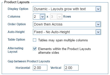
The Auto-Height option has three choices. Typically, it is only used with Dynamic templates, but it can be used with Grid templates as well.
This option will be discussed in greater detail in other tutorials but, briefly, it allows fields to grow, vertically, to fit the entire text. It also allows a field to disappear if it does not contain text.

The Table Option is only useable with Dynamic templates. It allows Detail Tables to cover multiple columns.

The Alternating Layout option causes objects in the display units to alternate side. This will be covered in greater detail in later tutorials.

There is also an option to change the size of the gaps between each display unit. The vertical and horizontal gaps can both be set separately.

Normally, images grow until they reach either the maximum height or the maximum width defined by the Product Layout. If the Photo Height option is checked, images will grow until they reach the maximum width, even if this pushes them past the maximum height.

If the Minimum Height option is checked, cells will be created as if they had an image of the height defined in the Product Layout, even if no image exists for that product.

Format Tab

The Formatting tab applies to elements in the Page Header, the Footer and the Borders for the Product Display Units themselves. A separate Formatting form is used for customizing the elements within the Display Units.

To change the appearance of any text element on the page, either click it on the Sample Page to select it and make it the Active Cell, or select it from the Active Cell drop-down menu.

Click any of the attribute buttons to edit the Active Cell’s format. To change the colours, click the hex code next to the colour preview to open the Colour Selection window.

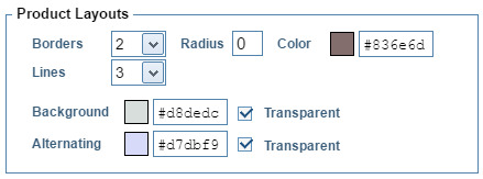
The options under Product Layouts apply to all Display Units.

The Borders option changes the thickness of the border surrounding the Layouts. Alternatively, the Lines option will replace the borders with dividing lines that only appear between layouts. If Lines has a value other than 0, the template will use lines instead of borders. Set Lines to 0 to use borders.

The Radius option will create rounded corners on the Product Layouts. A higher radius causes more pronounced roundedness.

You may also change the colour of the borders, background, and alternate background. If the background colours are defined in the Product Layout, those colours will be used instead.

Config Tab

The Working Category is used to select which category will be used to provide the data for Print Previews and also the cell labels on the Display Unit design and formatting forms.

Under Subcategory Options, the Printing Option allows you to have the Subcategory name inserted at various changes within the catalog. You can choose where you want these labels inserted from the drop-down list, or instead decide not to use them at all.


Return to Tutorial Selection