Samples Product Information Home Page Pricing Pricing

Product Layouts

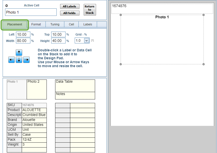
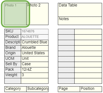
If you're coming to this tutorial from the one titled: Creating a Template, you'll recognize that the shape of the Layout on the Design Pad in the screen image below matches the shape of the Layouts on the Sample Page in that tutorial.

You only design a single Product Layout for each template, and that setup is used for every product in the category.

The form opens to the Placement Tab, where you'll notice that the values in the four boxes that define the cell: Left, Top, Width, Height, are recorded in percentages, not inches or millimeters. That's because you can change the size of the Product Layout at any time, and you'll want everything in the Layout to adjust automatically.


There's also a Grid - % selector. Many users will find it easier to place and size cells using the keyboard instead of the mouse. The Grid values sets the size of each step, and defaults to 1.0%.


Use your keyboard's Arrow Keys or Numeric Keypad as shown here to move and resize the Active Cell on the Design Pad.

You may have to toggle the Num Lock on your keyboard to enable the keys to work properly.


There are two Stacks of Cells on the bottom-left side of the screen.

For the Product Data, the Stacks are divided into Labels and Data Cells. The cell with the gray background and the text SKU is the Label, and the one with the text 1674876 is the Data.

To add a Cell to the Design Pad, double-click it's Placeholder on the Stack.

Note the dotted line around Photo 1 and the top two Data Cells on the first Stack, which indicates they're already on the Design Pad.

Should a Cell become hidden behind another during the design process, simply click its empty Placeholer in the Stack to bring it to the front of the Design Pad.


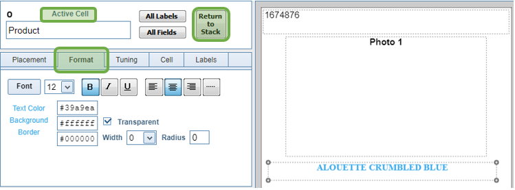
To remove a cell from the Design Pad, click it to make it Active, then click the Return to Stack button.

Use the controls on the Formatting Tab to style the text of the Active Cell. Some options, such as Alignment also apply to images.

For some Eastern European character sets, the only Font that prints all text correctly is Free Sans. For Simplified Chinese characters, try the font named Droid Sans SC.


The controls on the Tuning Tab are used for fine adjustments to the spacing between text.

There's also a Print Layer option, which allows you to print some cells on top of others. For example, it's common to print text on top of an image.


The Cell Tab can be used to the change the Cell's Type.

  • Text is the default Type and is correct for most cells.
  • Number and Currency: If the data in the cell is a number, it can be converted to Decimal format with the number of Decimal Places and Currency Symbol defined on the Printing Menu.
    For example, if the recorded value is 10, the printed value can be 10.00 or $10.00 depending on the options set on the Printing Menu.
    Also, if a Cell is defined as Number or Currency, you can use the Markup / Discount function on the Printing Menu to change the printed numbers without affecting the recorded values.

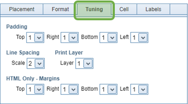
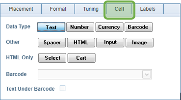
if Barcode is selected, then the Barcode Selector at the bottom of the Tab is enabled, where you can choose the correct Barcode Type. As long as the number of characters recorded is correct, a valid Barcode will be generated.

Spacer is used to create rectangles inside the Product Layout. Commonly, these are used as backgrounds or drop-shadows behind text. Use the Print Layer option on the Tuning Tab to place a Spacer behind another cell.

Use the HTML option to format the text with its HTML tags. You can use the built-in HTML Editor on the Datasheet to create these tags for inline formatting.

Input creates a user-editable field in the PDF document. This is most useful for an Order Form.

Image: There are two preset Image Cells: Photo 1, and Photo 2, but any cell can be turned into an image.
Even a Label can be an image, if the name of the Image File is recorded in the Category Editor instead of Header Text.


The Labels Tab controls how Labels, those Cells on the left of each stack, are printed.

  • Print Labels is most commonly used with Dynamic Templates and Data Tables.
    In some cases, you may only want Labels to print at the top of the page, or with the first product in each column, or at Category breaks. Use this option to hide the Labels in all other Product Layouts.
  • Hide Labels prevents the label from printing if there is no associated data. This can also be used when a Label is set to be a Spacer. For example, if you use a Label to create a drop-shadow effect, you probably don't want that to print without text in front of it.

Lastly, keep in mind that we can create templates for you--at no charge.

Contact Us with details of what you need the template to look like, and we'll design it and add it to your list of available templates.


Return to Tutorial Selection